One of the most interesting design details of the iPhone Duo is the animation when the phone unfolds. Aside from being gorgeous, it’s also functional. By making the inner screen appear to be “blurred”, it preserves your sense of place in the UI.
The first nine seconds of the reference video shared by Sawyer Merritt.
We reverse engineered the animation from a reference video shared by Sawyer Merritt and rebuilt it in software. Getting it to look right required more than blurring a screenshot: the content stays sharp near the hinge, softens toward the moving edge, and changes brightness as the phone opens. Even when the image is heavily blurred, the bezel stays crisp. In our reconstruction, both displays draw from one shared image behind the phone, so the content stays aligned as one screen gives way to the other.
Together, these details make the display appear to move around the content you’re looking at. We’ll start with the geometry behind that illusion, then compare the reference with our simulation and explain how we reproduced its blur and shading.
Why the animation feels physical
Imagine a sheet of frosted glass over a picture. Close to the picture, you can make out its details. Lift the glass away and those details soften, even though the picture hasn’t moved. Hinge the sheet along one edge and the gap grows toward the free edge, while staying small near the hinge.
That gives us an intuition for the Duo animation. The content appears to remain behind a moving surface, with changing softness suggesting separation. The crisp bezel makes the illusion more striking: you can still see exactly where the hardware is, even beside heavily blurred content.
A way to picture the illusion. The ray bends inside an imagined glass layer; a widening bundle illustrates blur. Scrub the fold to see both change on the moving panel. This is an optical analogy, not the actual behavior of the opaque screens.
The inner screen also starts darker and brightens as it opens. Focus and shading change with the movement, while the image stays recognizable. When the phone settles open, its content is sharp again.
How we simulated the iPhone Duo blur in software
We rebuilt the opening with a 3D phone model and a custom program that draws the screen pixels. Play the reference and reconstruction together below, or pause and drag the timeline to inspect a moment in the fold.
Left: the reference shared by Sawyer Merritt. Right: our browser render. The comparison follows the first nine seconds, skipping the half-second hold at the start of our exported video. We calibrated the camera and fold angles against the reference silhouette. Wallpaper placement, controls, and hardware reflections still differ.
The comparison also exposed a mistake in our first reconstruction: the camera was too flat. In the reference, the moving panel grows taller as it swings toward the viewer. Fitting the camera and fold angles to its outline made that depth much more convincing, before changing any blur.
Give the displays one image to reveal
A screenshot attached to a rotating panel turns and narrows with that panel. To create the impression of content behind the phone, we gave both displays a shared virtual image plane.
For each visible screen pixel, the renderer traces a straight viewing ray from the camera to that plane. The intersection selects which part of the image to show. Two display surfaces on the same ray therefore select the same image point. The cover can give way to the inner screen without making the picture jump.
The hardware remains solid: nearer panels hide the surfaces behind them. Our source image includes the clock and controls, taken from the reference’s fully open screen and corrected for perspective. It keeps its scale and aspect ratio, while its center moves toward the hinge during the handoff.
Keep the hinge sharp and soften the free edge
A uniform blur would remove detail near the hinge too. We needed the softness to increase steeply toward the moving edge.
Our early version increased blur linearly with distance from the hinge. Stronger blur at the edge, with a cubic falloff toward the hinge, looked more convincing:
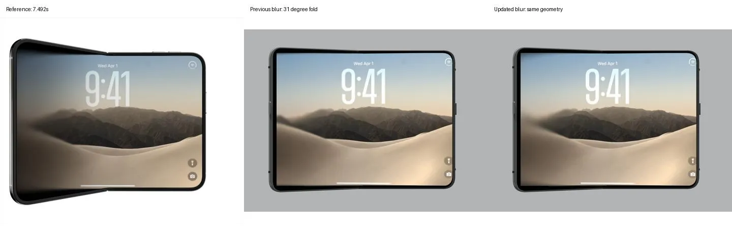
Left: reference. Center: our earlier blur. Right: stronger edge blur with cubic falloff, before the later shading pass. Compare the soft left edge with the sharper content near the hinge.
In the revised model, at a 30° fold the free edge has a Gaussian blur strength of 48 source-image pixels. Halfway from the hinge, it’s only 6. That difference lets central details remain readable while the outer region becomes diffuse. The hinge and settled endpoints stay sharp.
These values came from visual tuning. We blurred the full source image before drawing it onto the displays, keeping the effect inside the hardware outline. We also made surfaces along the same viewing ray use the same blur strength, so focus wouldn’t jump during the handoff.
Let each display have its own brightness
Even after correcting the blur, the inner display needed to darken. We gave the cover and the two inner panels separate brightness curves. The rotating inner panel darkens more toward its free edge; the visible closed and open endpoints retain full brightness.
Brightness is applied after blur. Two displays can therefore show the same image point at the same focus while looking differently illuminated. Watch the exposed inner screen early in the comparison: matching its softness alone wouldn’t reproduce that darker appearance.
Our prototype uses Three.js and WebGL2, with fourteen precomputed blur levels that the renderer blends as the phone moves. We captured repeatable browser frames and compared them with decoded reference timestamps. The technical notes contain the equations, rendering details, and measurement results.
Preserve the thing someone is reading
We then replaced the lock screen with an Empirical Health screenshot. The LDL detail view stays anchored to the stationary display while navigation and the metrics list appear on its left.
Our screenshot-based prototype. More context appears around the result already being viewed.
For this version, we fixed the virtual image center at the hinge, keeping the detail view in place. This app example uses the earlier camera and timing, with the same shared-image blur technique. High-contrast text exposed tiny disagreements between the surfaces’ image sampling; deriving their viewing rays directly from output pixels removed those discrepancies in our checks.
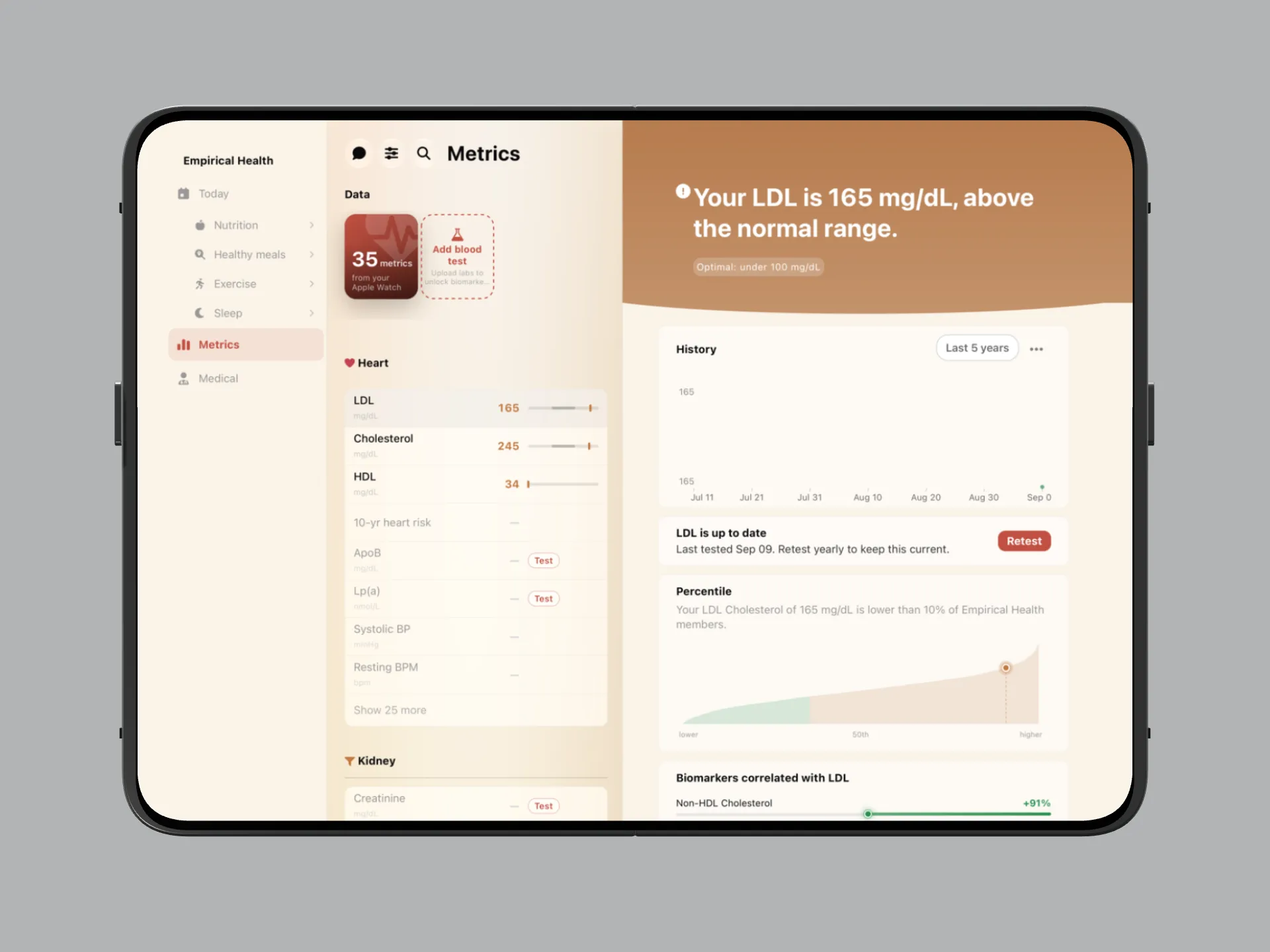
The selected metric and its detail remain connected in the open layout. This demonstration uses a static screenshot.
A working app needs to preserve more than the picture. The selected result, chart range, scroll position, and unfinished message must survive the layout change too. Someone reading their LDL history should be able to unfold, see the surrounding metrics, and keep reading the same chart. When they close the phone, the result and date range they chose should still be there.
Get your free 30-day heart health guide
Evidence-based steps to optimize your heart health.